D&D Art
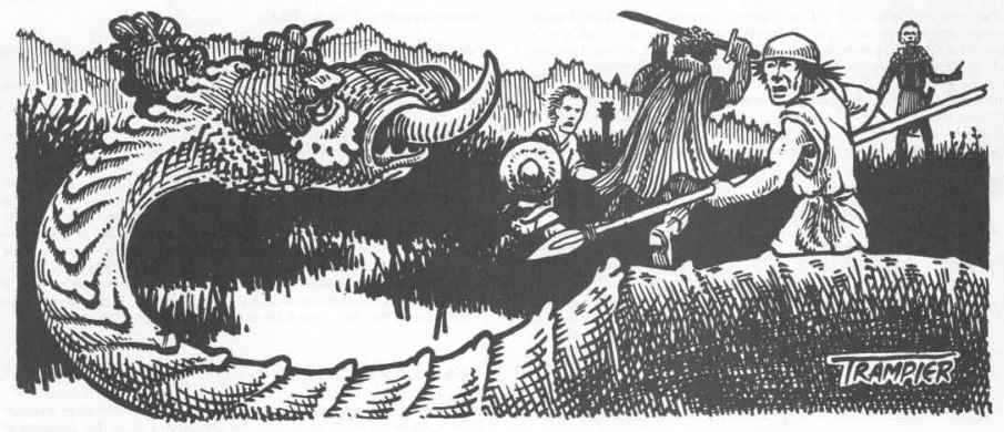
Deltas D&D Hotspot asks about the changes over time in D&D aesthetics, and focuses in specifically on depictions of violence against player characters:
I've come to think that one of the biggest sensibility differences between old-school D&D art and and newer-school art is the amount of violence depicted against ostensibly player-character-types. I find that new-school illustrations are frequently "glamour shots" of presumed PCs. In these depictions, the adventurers look generally clean, rested, comfortable, and pretty.
In contrast, the art in early editions of D&D often depicted adventurers in general distress -- dirty, tired, surprised, shocked, terrified, fleeing, smothered, pierced, poisoned, and mangled. And the weight of the body structure was in realistic proportions that looked all-too-humanly fragile, not like models-bodybuilders-superheroes.
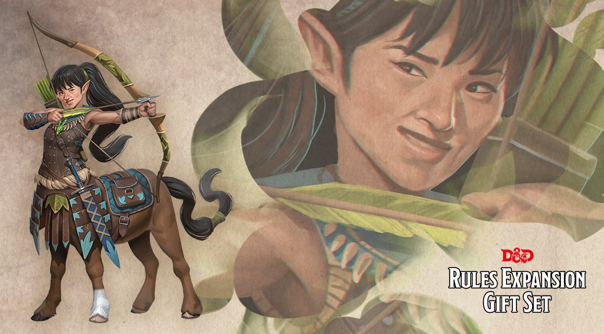
Delta’s post was written before Wizards of the Coast published their derpy centaur picture, but it is an excellent example of the modern glamour shot style that has become the standard.
This matches up with something the Emperor Norton said in his series on the baleful effects of social media. The Emperor was talking about how social media has distorted how artists practice their art, but he used D&D as a convenient example.
Compare the inevitable weirdness of fantasy and sci-fi art from the 70s and 80s to the boring, digital sameness of today, a difference not necessarily due to lack of skill (many artists back then were clearly amateurs) but shrinking and centralization of references, styles, and content to imitate and copy, as well as the obligation to submit to popular fictional products and mental references (e.g., a fantasy barbarian has to look like fantasy barbarian—like what Google shows when you look it up.) The difference between the cover artwork of the old Dragon (D&D) with their more modern versions is pretty telling despite, in some cases, the difference being only 10-20 years.
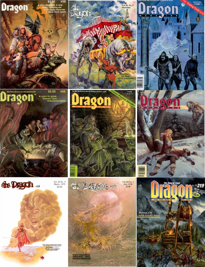
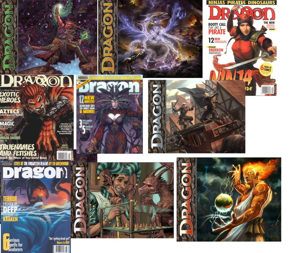
Delta looked at the illustrations in the original AD&D rules books, while Emperor Norton looked at the covers of Dragon magazine, but I think you can see the same trends occurring in either sample.
The most obvious difference is that the group of adventurers has disappeared, as well as environmental storytelling, that is, the background, the scene, and the story they told. The individual, usually close up or posing, takes precedence, as well as magical noise and superhero effects (lightning/magic effects.) Newer visual art usually doesn’t tell a story because storytelling is not part of the decision process and creative workflow, especially for the novice artists who get hired for this kind of work.
Almost all of the original AD&D rulebooks had illustrations that showed a party of adventurers in a scene. Oftentimes, it was extremely perilous or dangerous, which is another notable difference between old style gaming and the present. A commenter at Delta’s post made an attempt to enumerate the difference in peril in the rulebook illustrations over time.
1st Edition (AD&D)
Fear: 18
Held/Helpless: 12
Kill Shot: 8
Dead Body: 6
Zapped!: 7
Total: 51
AD&D 2E
Fear: 4
Held/Helpless: 1
Kill Shot: 2
Dead Body: 4*
Zapped!: 1
Total: 12
DND3 (3rd Edition)
Fear: 6
Held/Helpless: 10
Kill Shot: 1
Dead Body: 2*
Zapped!: 3
Total: 23
JB didn’t have a copy of the 5E Player’s Handbook, but I do, and I looked, and by my count there are zero examples of fear, helplessness, or dead bodies in the book. Which fits in the with general fantasy-themed superhero gist of the modern style, untouchable demigods who are almost impossible to kill.
I suspect these trends have a kind of cybernetic feedback loop, but it is interesting that it is probably very hard to find an artist who can put characters in a scene or tell a story visually. There are millions of starving artists on Twitter who will draw a D&D character in the glamour shot style, but not that many who display images like the original D&D art.
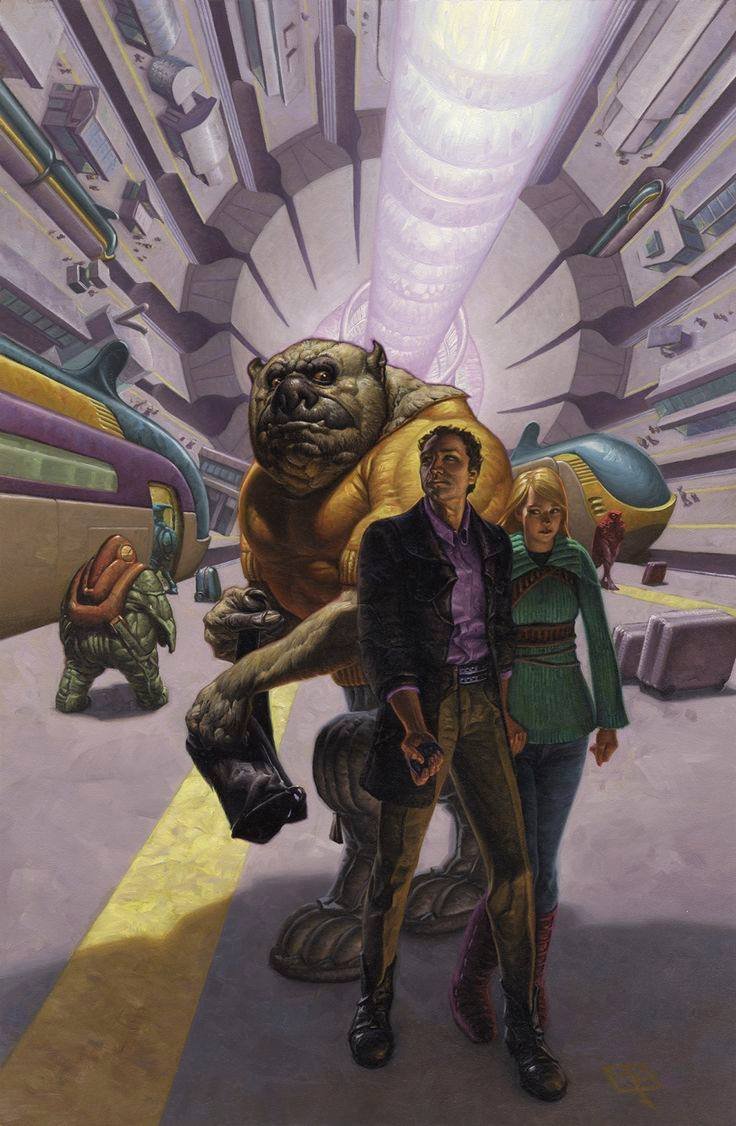
This is probably why I’m so in love with Mark Zug’s cover for Timothy Zahn’s The Third Lynx. There is a story told in that image, one that matches up perfectly with the book.


Comments ()